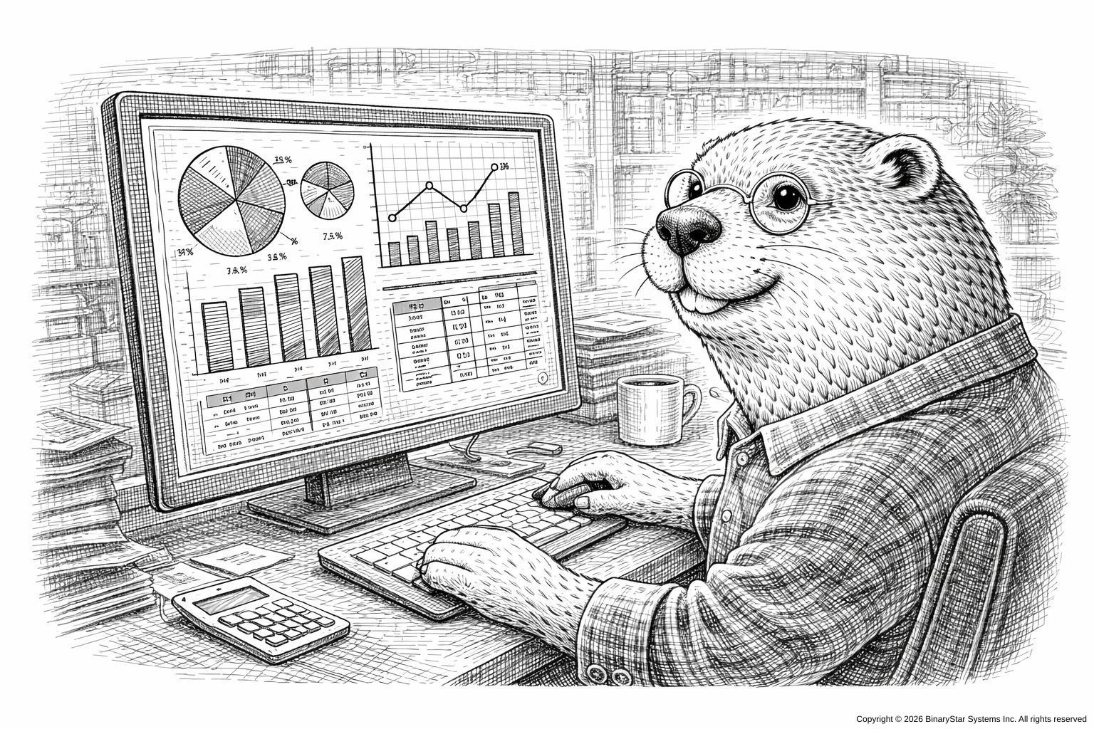


from Fear-Driven Compliance: A Practical Guide for Auditors and the Audited™ (O’Reilly Media — cover animal: an owl wearing glasses and silently judging your metrics)
Introduction
Compliance dashboards are rarely used for compliance.
Their purpose is aesthetic reassurance: to create a tranquil, data-rich glow that convinces auditors, executives, and occasionally yourself that everything is under control.
This chapter explores the art of Dashboard Theater—the careful design of interfaces that look impressively compliant, regardless of what your systems are actually doing.
Note: Actual compliance is encouraged, but not strictly required to produce excellent theater.
What Auditors Expect to See
After years of exposure to enterprise software, auditors have formed an instinctive checklist for dashboards:
- At least three gauges
- A multi-colored heatmap
- Something vaguely resembling real-time data
- A graph with a trend line that goes up (or down, confidently)
- Buttons nobody dares click during an audit
Your mission: give them all of this, and then some.
The Illusion of Control
The primary function of a compliance dashboard is not accuracy; it is vibes.
Technique: The Strategic Green Zone
Make 80% of the dashboard green at all times. If something is actually wrong:
- Change the shade of green
- Change the label
- Create a new category named “Monitoring Required”
- Or, if necessary, add a small spinning icon labeled “Reconciling…”
The auditor will nod approvingly.
Figure 9-1
A dashboard with many green boxes and one red box labeled “Ignore for Now.”
Graphs That Imply Competence
Auditors love graphs. They understand them only superficially, which gives you complete freedom.
Recommended Graph Types
- The Diagonal-Line-That-Suggests-Improvement Graph
- The Sine-Wave-That-Looks-Like-Seasonality Graph
- The Multi-Line-Graph-Where-All-Lines-Converge-Meaning-Something-Harmonious
- The Bar-Chart-With-No-Units
If asked what the y-axis represents, say confidently:
“Normalized compliance throughput.”
This satisfies 97% of auditors.
Widgets That Impress Without Revealing Anything
Certain dashboard elements are inherently authoritative:
Speedometers (for things that do not have speed)
Thermometers (for things that do not have temperature)
Donut charts (because everyone loves donuts)
- Maps
- World maps if you really want to crush the meeting
Maps imply global operations, even if you do not have any.
Figure 9-2
A world map with three glowing dots labeled “Activity.” No one knows what that means.
The Art of Fake Real-Time Updates
Real-time data is expensive. Simulated real-time data costs nothing.
Every 15 seconds, subtly update:
- A timestamp (“Last Sync: Just Now”)
- A number (“Current Queue: 14 → 13”)
- A metric labeled “Status: OK”
Auditors relax when they see movement. Movement suggests life. Life suggests governance.
The "Dangerous Button" Strategy
Every dashboard should contain at least one button that nobody will click during an audit. Examples:
- “Advanced Mode”
- “Override Controls”
- “Deep Compliance Dive”
- “Show All Logs”
- “Legacy PICK Interface”
The auditor will stare at it and think, “I probably shouldn’t touch that.” Excellent. They will not.
Customization Theater
Show a toggle or filter panel with dozens of options such as:

“Quarterly Audit Drift Compensation”
“Anomaly Confidence Bandwidth”
“Access Role Entropy Threshold”
“Predictive Control Instability Forecasting (Beta)”
None of these do anything. They exist to convey intellectual horsepower.
If an auditor asks for details, respond:
“We’re still validating the model.”
This satisfies 100% of auditors.
The Infinite Scroll of Logs
Add a log viewer panel with endless scrolling text. It doesn’t matter what the logs say; no one will read them.
Populate with neutral entries such as:
“Process completed.”
“Queue updated.”
“Validation passed.”
“Heartbeat OK.”
If you want to be bold, include one cryptic entry:
“Subsystem 4: Recursion limited at threshold.”
This will haunt them.
Figure 9-3
A log panel with many repeating lines. One line reads ‘Warning: None.’
Handling Questions During Live Demo
Auditor: “What does this graph show?”
You: “This shows our compliance posture trending in the expected direction.”
Auditor: “Why does this number keep changing?”
You: “That’s the dynamic reconciliation agent.”
Auditor: “Why is everything green?”
You: “We’re very proud of our results this quarter.”
Auditor: “Can you prove the data is accurate?”
You: “Accuracy is essential. What definition of accuracy are you using?”
Conversational Jujitsu seamlessly supports Dashboard Theater.
Summary
Dashboard Theater is the intersection of:
- confidence,
- color coding,
- motion graphics,
- and the universal truth that auditors find anything animated deeply convincing.
When done well, your dashboard becomes a radiant shrine of compliance, emitting an aura of governance so strong the auditors forget their follow-up questions.
Footnotes
- Donut charts are required by the International Visualization Consortium, probably.
- The spinning “Reconciling…” icon may cause executive hypnosis.
- The legacy PICK interface button should never be clicked under any circumstances.
Next Chapter
Chapter 10: Rituals and Offerings — Preparing for the Annual Audit
Next Step:
🗓️ Schedule a discovery call
Talk about issues and opportunities for your current system before you commit.